I created this theme because a lot of users in the community were asking for a darker theme that was sober to read even if you're an experienced 3D user or a client gazing at the workspace. I wanted to make it easier for the UI to point to the little crucial buttons in the UI which were grayed when you click on them.
The Blender V theme also solves the problem to "jump cut" if you're recording tutorial videos when you have small pop up menus selected (i.e. the window editors, overlays, add a modifier, etc.) where the client or unexperienced user watching the video doesn't know why the button "popped" something and needs a strong visual color (in the theme is bright orange).
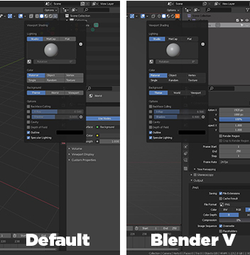
I also took the time to customize the selected TAB colors in the N panel for the 3D viewport only, since 90% of the addons rely on the N menu of the 3D viewport. With this theme, it’s easier to even maximize the viewport and the first time user / client / not experienced viewer will still be able to identify what’s going on with the selected tab’s addon or parameter.
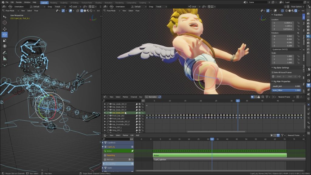
Unnecessary multi-colored bones are distracting, so the selected colored channels by Blender’s default theme add to the visual noise. All bone channels in the NLA, Graph editor, DopeSheet were edited to have sober colors. Everything about these choices are explained in a 14 minute video in the link at the end of the thread.
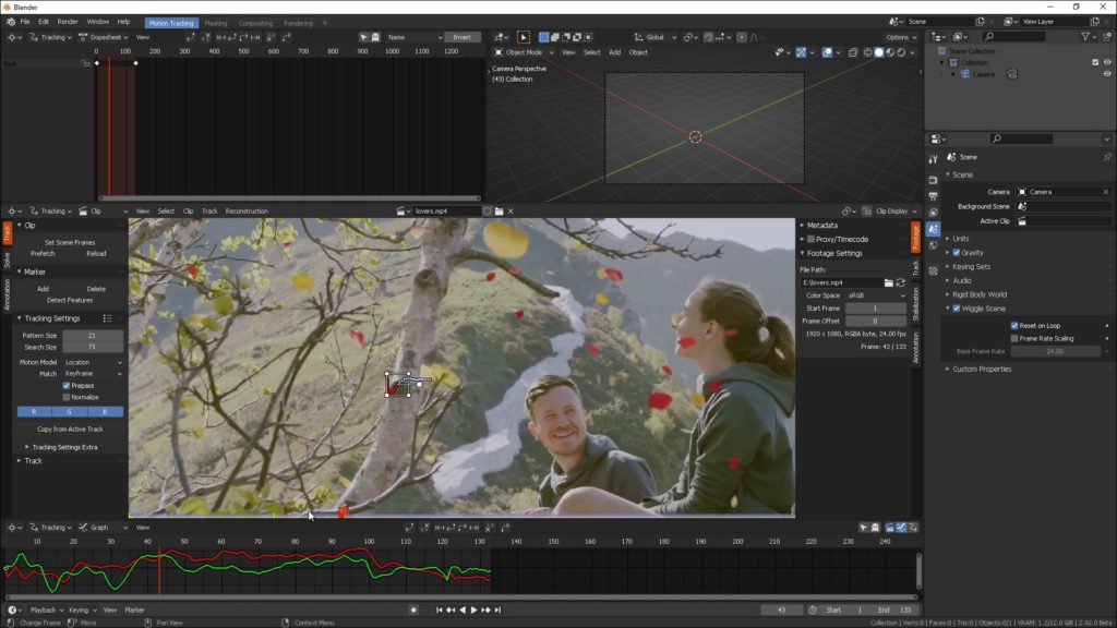
Movie clip editor (a.k.a the TRACKER) didn’t work with most of the settings it had, I already reported them as bugs. Aside from that, the CRUCIAL parameters as well as the playhead are not obvious from the Blender default theme and I switched them to bright orange, since ALL of the tracking operations reside in these (hidden by the default grey color) tabs.
When big files load the “blue-cyan” color of the bar, which is used everywhere else for SELECTIONS, doesn’t communicate clearly that there is a background process being “completed”.
Hence, Blender V switches the color of the progress bar to something that presents a completed process in GREEN COLOR.
Green (in different shades) is what we use in Blender for the keyframes, in the dope sheet, in the NLA in the graph editor, it only makes sense for the new user that all of these key-to-screen colors for completing a task are presented in Green as in “ready” state.
Also, I can’t emphasize enough how important is for the new user to READ the outliner properly when you have multiple selections. In Blender V, last selected is Cyan blue and Active selection is White.
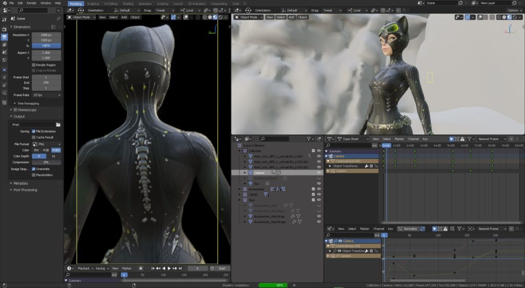
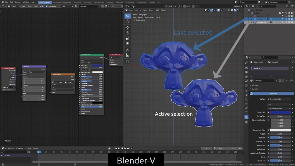
You can see extensive details as to why these color choices were necessary in this video covering NLA, Tracker, Grease Pencil, VSE and other editors.
You can download it for free in Gumroad,
(make sure you have whitelisted this site in your ad blocker to see the link AND THE VIDEO PRESENTATION).
If you'd like to donate to this theme's development, thank you so much:
Comments