XSIMOD THEME for Blender 2.83 (Updated March 2020)
on
Get link
Facebook
X
Pinterest
Email
Other Apps
The XSIMOD Theme for Blender 2.83 went through major scrutiny for the buttons, properties, parameters, numeric boxes, selection and UI elements in general. This post is intended as a guide so you can find your way through the colors of the user interface. Here's a complete review for...XSI UI Colors
Definition rules for HEX colors: General UI color: #aca8a7 Model Module Panel color: #a18aa4 Menu Selection: #a18aa4 Divot / Cubic button: #9eb895 Animation Playhead: #a2150a Floating panel menu titles: #617388 Render module: #8b99a3
The color palette was created according to the trends of the Windows98 colors so the users will not be alienated when the software was installed in WindowsNT machines. There for the choice for the palette had to be reduced and optimized to be non-distracting with low contrast, almost "pastel" colors.
This way, the user experience was to be focused more hours in the interface without spiky colors dispersed in diverse iconography. This task was accomplished by naming buttons instead of creating "new" icons for an ever-expanding array of tools. This is the preferred way for complex software as a design choice, considering the application can grow quickly and there is not a clear or concise way to represent complex 3d functions with Icons universally.
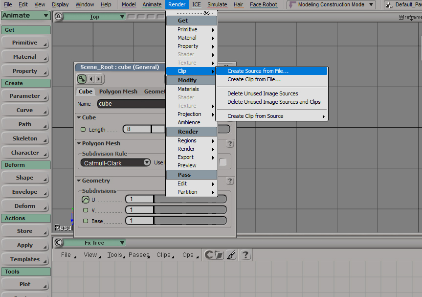
Softimage Top Menus, Modules, selection and numeric sliders
In the above example, to the right: We see the Animation Module which is represented by a washed green color, in contrast with the floating windows with different "animation" parameters, also coded in a different "brighter" shade of green. This is important since the green and blue colors are colors that can be watched for a long time naturally, without causing an eyesore. This color combination is why landscapes with greenery and a blue sky tend to relax us. Producing animation tasks can go anywhere between a couple of hours to a couple of years, and looking specifically at this module should be something of a routine without getting us tired.
SCROLL ALL THE WAY DOWN THE PAGE AND CLICK ON PAGE "2" to continue reading the post>>
Softimage Render
Completing a 3D project means you have to Render images.
One of the most common tasks in any 3D software is to finalize the animation created with the Render process. The UI module for this was defined with a soft blue tone. In addition, this is the screen color that was most active for the 3D application for the user. Soft red-colored buttons denoted something that was animated and keyframed. There are green-colored icons with blank space and others containing a "curve" to identify those channels which contain keyframes. -Blank to Simplified- representation of animation curves is a great way to not fill the screen with distracting imagery sitting still cluttering the workspace. The icon changes, and becomes active, only when it's in use. Here we find another principle of design: Utility over form.
Enter XSIMOD Theme
The scope of reviewing the entire Softimage interface and why it stood the test of time in the 3D industry is far too long to do and escapes the intent of this post. We will review what design principles were assigned to the Blender interface to customize it with this theme. I will also point where a design rule breaks and how it can be -currently as the time of this writing- be fixed.
XSIMOD Theme for Blender 2.83
I will take the initial reference colors presented at the beginning of this article to interpolate functions over other areas in Blender that were not existent in Softimage, improving whenever possible, a choice for palettes that favor contrast and neutrality for long hours exposed to the monitor light indoors. In other words, the goal is to alleviate the user experience and help to a quicker identification of the operations in the interface.
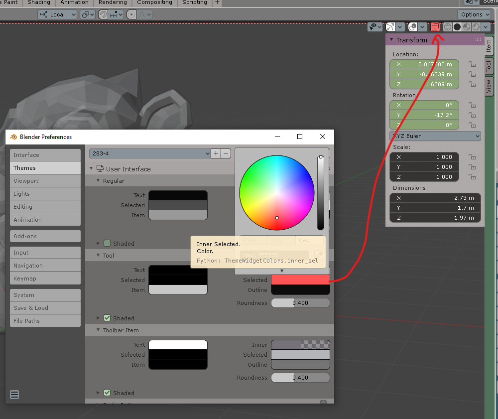
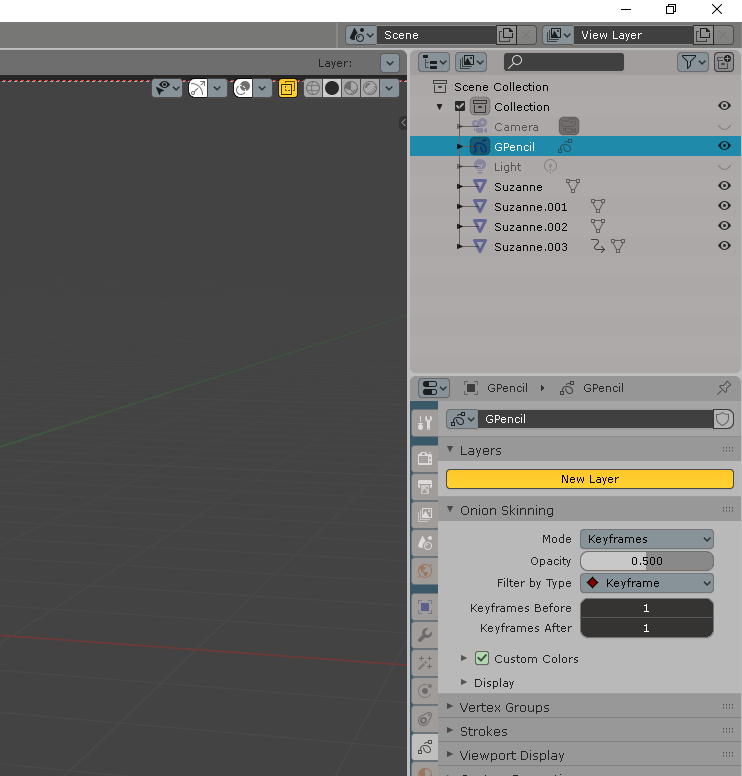
EDIT>Preferences>Themes is the general category that I will be adressing for the rest of the post. When you see a "/" means the subcategory where you can modify the colors. In this picture you access the colors in the N menu from "/3D View>Theme space>Panel Colors.
Change the property icons from the /User Interface>Icon Colors. Scene Icons are white.
"SCENE" color is set to BLACK which makes all SCENE related icons BLACK.
Following design rules, we can find harmony/constrast colors to represent the different icon categories: Scene, Modifiers, Shading.
The shading tab icon is orange because the most important nodes in the MATERIAL EDITOR are orange: Texture and images. The user doesn't have to know this at first, but his subconscious will trigger correlated memory making a cohesive experience in the future when he needs to divide the workspace in different windows. Associative memory is put to use.
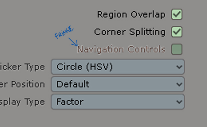
This is where you find the culprit for the fringe text when you don't want to use "anti-alias" text option.
Yes, this white halo around text is called "fringe" and you should avoid it like the plague.
Consistency in XSIMOD theme for Blender
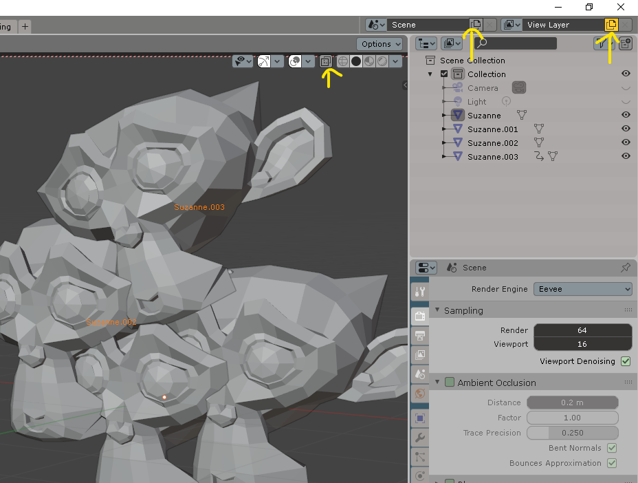
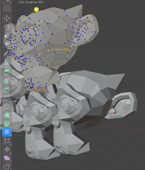
You can clearly identify the monkeys' colors in the Viewport and Outliner (Finally!)
Bright colors draw first level of attention, the second menu has the normal selection color code, making good contrast to read in HD monitors. (Needs testing on UHD).
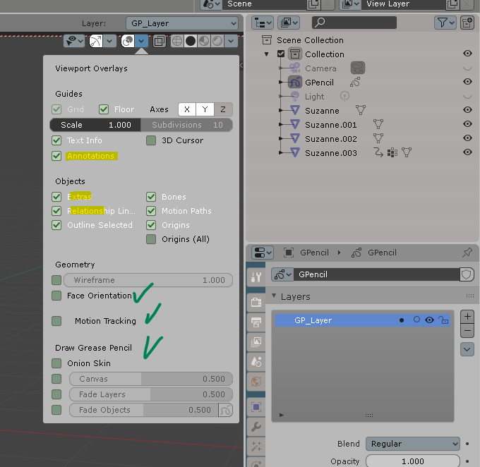
Options in Grease Pencil (brush sensibility and opacity icons) as well as the Official PIE menu addon, have also been taken into acquaintance for the theme.
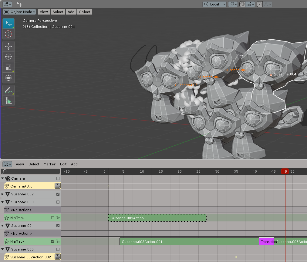
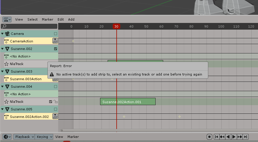
NLA tracks identified with green (Ready) action clips. Video sequencer editor has blue Video strips by default and pale dark yellow stripes for audio. NLA also has audio clips with pale dark yellow color.
When your track is converted to a clip, you see a GREEN color container (green=ready). If your track is NOT converted to NLA Clip but instead remain as ANIMATION ACTION, the track color is YELLOW so you can identify that IS THE ACTIVE track over writing all under-tracks and that you should be warned (yellow=warning) to either convert to NLA or Mute the clip.
Here's a rare capture of a META NLA STRIP with the bright green color.
NLA Transitions (unselected)
NLA Clips can only apply Transitions (purple box when selected) when they are in THE SAME NLA TRACK.
Complete NLA with applied XSIMOD theme: Yellow for tracks that haven't been converted to NLA clips, Green for NLA ready clips, Purple for NLA clip transitions.
If you have an NLA clip you need to adjust the animation curves inside, just select the NLA clip and press TAB. You see the "selection" EDIT color being a cyan to edit your animation curves in the the Graph Editor. Notice the cyan color in /NonLinear Animation menu.
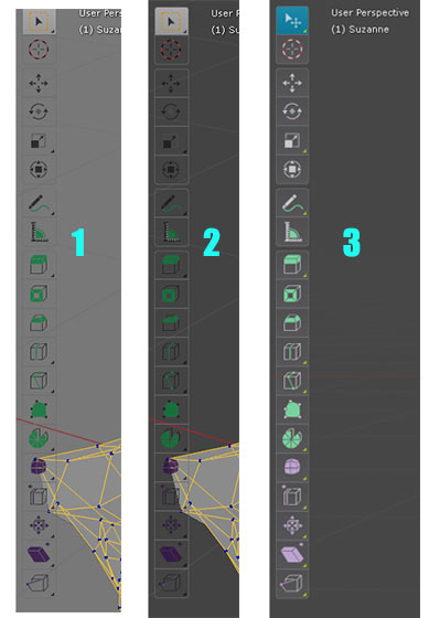
Bar 1 - Medium contrast. Bar 2 - Low contrast. Bar 3 - High contrast. Bar 3 applies "selection" (cyan) rule of importance with the current tool active.
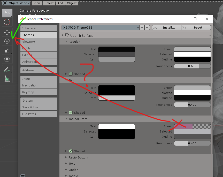
If you chance the color of /User Interface/Tool you can change the "SEE THROUGH" button and other buttons in the interface regarding the category "tool" (?)
These buttons are labeled in the "Tool" category. Choose a bright yellow to differentiate your click selection for ACTIVE/INACTIVE
SCROLL DOWN THE ARTICLE AND CLICK ON THE NEXT PAGE>>
Blender's issues with themes
I am glad you reached this section because you may be thinking "Wow, this is easy! I can create my own theme right away!", and that's exactly why I prepared this section so you can really watch out for these inconsistencies while the developers work hard to stabilize some of these issues (Scroll left or right in the gallery):
With a medium contrast background this is what you get on EDIT mode. Not suitable to work for hours of modeling.
Instead, you can use a high contrast background like this to identify the bright gradient lines whenever you choose vertices/edges.
(No compression image) to compare the contrast-y difference. Dark background is recommended.
You remember that "SEE THROUGH" Button we mentioned earlier? Guess what's gonna happen to your "SAVE AS" button on the File explorer...
/User Interface>Tool>Selected. If you change the color here it will affect: SEE THROUGH, NEW SCENE BUTTON, VIEW LAYER, SAVE AS, Timeline "AUTOKEYING" button. This seems to be a "legacy UI" setting which now needs to be adressed. Tool is not a button and there is no clear category for them being in different parts of the UI: (TOP BAR), (Animation timeline), 3D VIEWPORT and Top menu of the workspace...
Further, if you change colors and "save as" your scene, you will encounter the "Save as button" with the color you chose for "Tool>Selected", and then you occur to press "CANCEL" you will find both buttons are now highlighted. This could be fixed by using "Inner" tag on "Save as" (rest state). I would advise to even switch the name from "Inner" to "Unselected" because by definition if the button has an "Selected" state the rest position will be the unselected state. The user can find this logical and quicker to use appropriately.
The "auto contrast" function in the toolbar (which changes the icon color to something of contrast against the background) has a glitch.
If you change the color of the icon on SELECTED from the left side, the Tool bar icons will not change color.
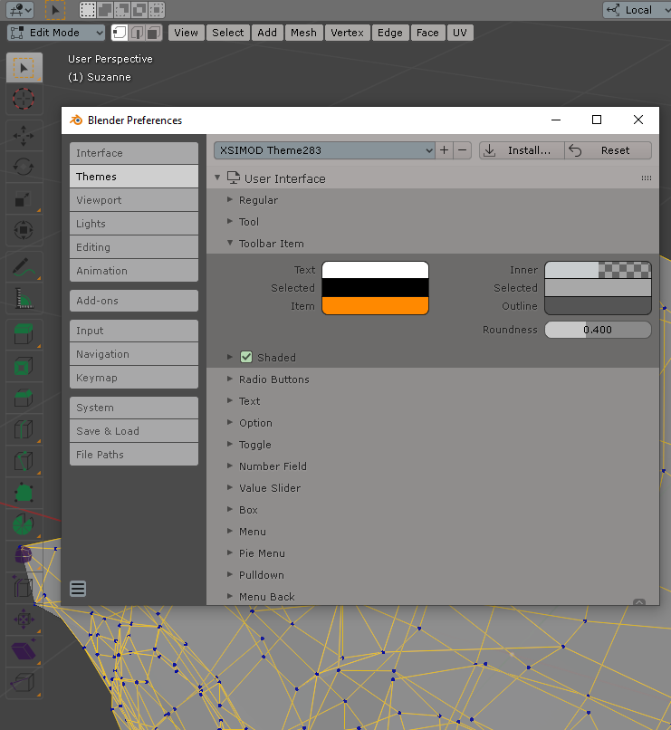
Toolbar Item changes correctly the ITEM (little arrow on the lower right part of the icon), but will not acquire the SELECTED color. So "INNER" on the right side of TOOLBAR ITEM can only be drawn towards the light color (white) and it will become an Inverse contrast to the background. The same thing happens when you use black. There for, you can't customize the color of the Toolbar Icons, you only have white or black colors.
/User Interface>Regular>Selected causes this to appear as a button. That "Use Nodes" should be moved to a category of it's own in Preferences workspace options which already exist.
The AUTOKEYING button is affected by "Selected" in the "REGULAR" Category from user Interface. It would be very convenient that this button was affected in it's own "buttons" category in the Animation Timeline (Selected)
In /Nonlinear Animation> "Active Action" the NLA marks the active strips, even though they are marked with an "x" as INACTIVE.
This dialogue was from an "inactive action" layer and thus confirms that Blender knows this is an "inactive action", there for the issue resides on the UI color.
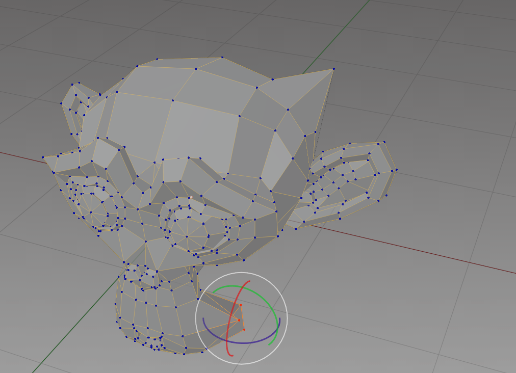
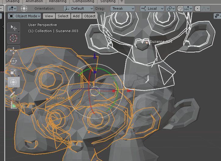
This is what I call "a stress test" or a "tension zone" regarding the UI. It happens when more than 5 lines cross themselves in the same interface. Observe the vertices from the monkey under the Tool bar and their contrast/identification. This is why marking "Active" as only black or white is a little bit restrictive.
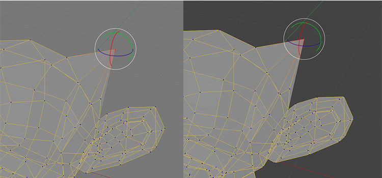
In the end, the XSIMOD theme will use this configuration for the correct contrast against dark background. Stress zones should not occur unless intended on the left side of the viewport.
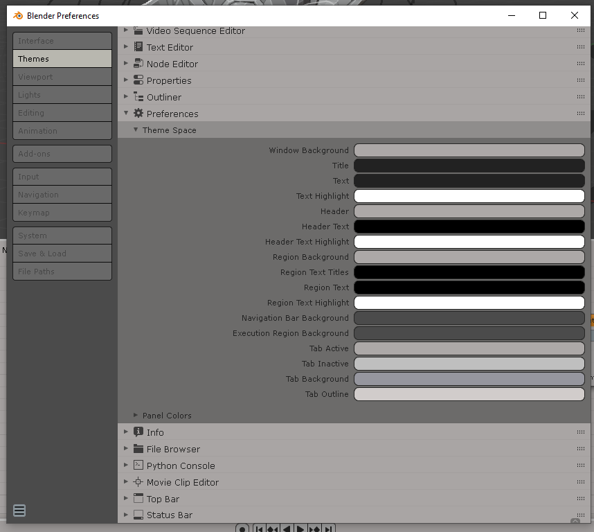
/User Interface>Menu Back>Selected (left side) controls the text on the POP DOWN menu. It would be convenient to move all the text color to "Pull down" category with it's own text color. That way all the pull down menu (pop down menu) will have the same text color at once.
Some parts of the text are controlled from other parameters in the theme options, and others from /User Interface>Menu Back>Selected (left side of the menus).
These menus are there for Legacy purposes only. I tried moving these parameters and they do nothing on all the subcategories. They could be labeled "Legacy Theme Space Colors".
The XSIMOD Theme correctly identifies first and last selections on the outliner with the objects in the viewport. This hasn't been addressed in other themes. The user doesn't know what is selected first or last, the only visual clue is the color of the white or yellow monkey. They correlate in the outliner. This is something to have in mind while designing your theme.
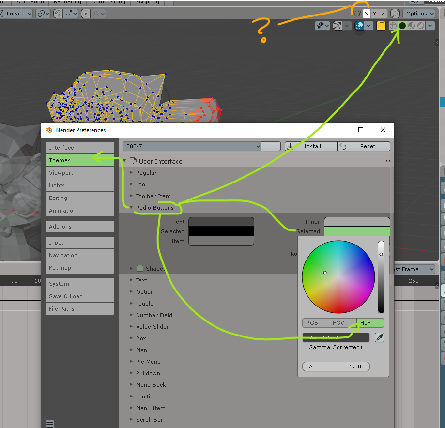
The Tool Bar, The Outliner, the Menus, and the Selections are correctly identified in the User Interface>Regular, Tool, Toolbar item, Radio buttons. "Radio buttons" are also coming from legacy naming convention, they could be moved to a "button" category of its own INSIDE each of the subcategories. That way "Active", "Inactive", "Outline", "Text selected", "Text inactive" could organize UI elements.
Radio buttons are important. But these are long buttons, and not radio.
We can see some of the color inconsistencies when /User Interface>Radio Buttons>Selected is changed. You can see in the green arrows what is affecting. Also, What are symmetry buttons? Radio? Tool?
/User Interface>Regular>Inner drives only certain buttons in the Top tool bar, but pressure icons are not affected by it. "Regular" is not an accurate description. Suggestion: "Inactive" instead of "Inner" and rename "Regular" to "Top tool bar" containing elements of the top toolbar.
The "Auto keying" should be in the Animation Timeline category with it's their own buttons' color configurations for Active, Inactive, Text, Outline. Here in this capture /User Interface>Regular>Selected affects the buttons presented in the top user interface, but why affect the Auto Keying button down the Animation Timeline?
/User Interface>Regular>Inner affects those buttons in the top bar.
"Selected" Changes the background of the selection. Mind that when you're designing your theme.
The XSIMOD Theme has white as ACTIVE selection, since the viewport shows "Active object" in white. The outliner also reflects this in WHITE color using the "cyan" selection as consistently as the rest of the menus, pie menus, and top menus.
Let's talk about the "See through" button and how to color it without affecting the "save as" button.
/User Interface>Selected (from the left side menu) controls the icon colors of the sensitivity pressure bar at the top BUT NOT the icons marked with the red arrow because they are turned OFF by selecting them from the viewport. Again, the best indication here could be "inactive" from the right side menu color option.
/User Interface>Regular>Selected from the left side of the menu, doesn't control the icons marked with the RED arrow when PUSHED ACTIVE. Instead, they appear colored when INACTIVE. Doing the opposite of "Selected" state.
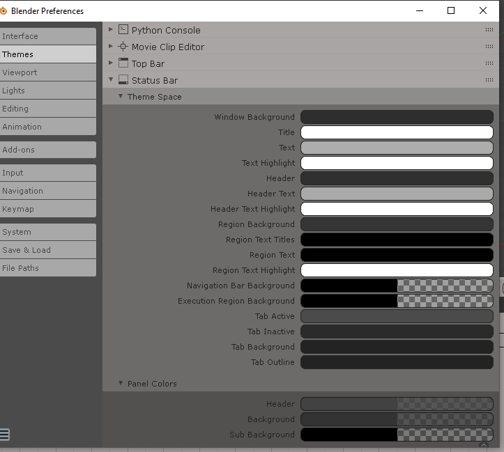
/The status bar>Theme Space doesn't seem to change any of the status bar colors at the bottom of the Blender's interface.
I tried so hard to find where this color was in the Theme options of the status bar but couldn't find it.
If you know the name of the ui color for the status name in the menus of the theme, please let me know.
Stress test for overlays on top of the tool bar. So far, this works visually to organize the many lines in their own 3d space.
The XSIMOD theme resolves this maintaining the selection rule for menus. Good contrast against purple icons.
This is where the user can configure the TAB appearance for the properties or the work spaces.
Grease Pencil tools have correct contrast with this color selection.
Yellow buttons favor very important things to notice in GreasePencil, unfortunatelly, we will also get a yellow colored "Save as" button as we have shown before.
/User Interface>Tool>Controls all of these "INNER" (inactive) buttons. Renaming an appropriate category other than tool, or moving their buttons to their own relative work spaces (top bar, 3D Viewport, Top most bar, etc) could guide the user better.
This option doesn't work as it's supposed to change the Item color of the button (icon) but it's blue instead.
Green Check: Expected behavior (purple), but instead we get a red arrow: color doesn't change the toolbar icon color.
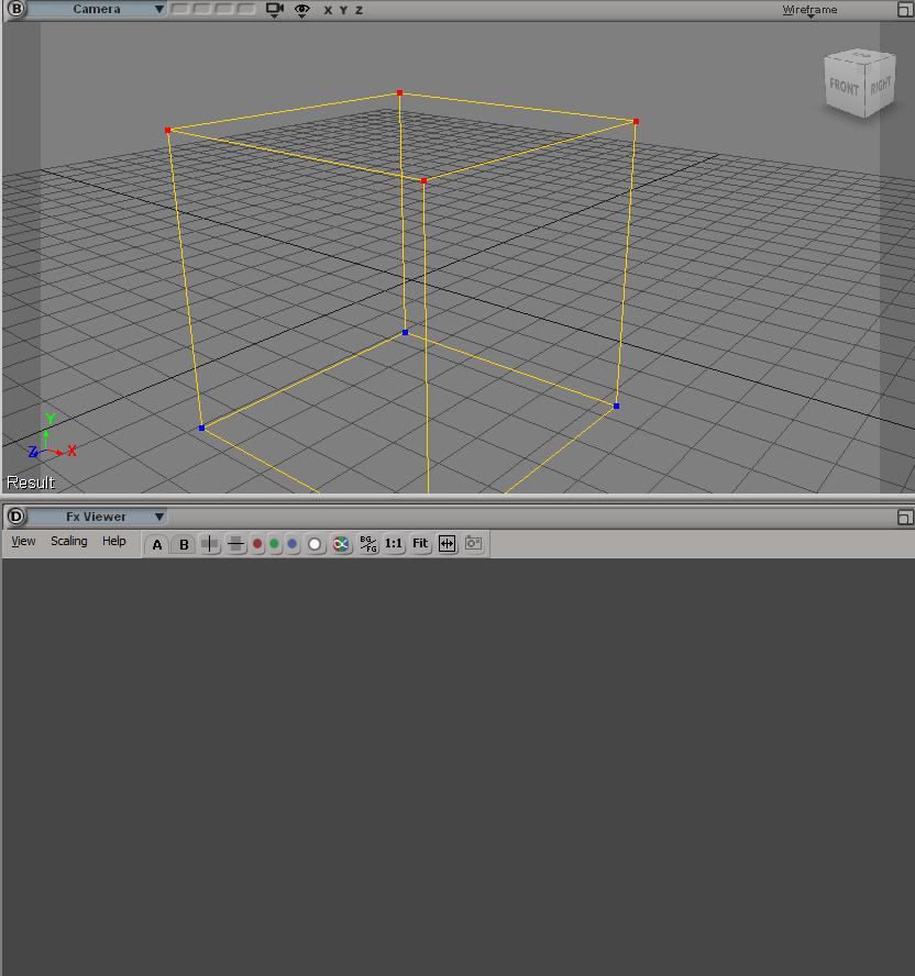
Softimage DOES use darker grey workspaces. So, it is native (notice FX Viewer)
Alpha = 0 controls the background of the toolbar. Toolbar Item is not reacting to any changes.
Finally, the XSIMOD Theme (bar 3) with all visual issues solved.
Thank you for your patience following this thread up to here. I really appreciate it. Bear in mind that I could spend more than 19 hours (as the time of finishing this writing and the stress tests on Blender) talking about UI choices for the best recommended UIX with the XSIMOD theme, but I hope you will find these settings a great way to start customizing your own themes in Blender 2.83.
Let me know if you found solutions or if you know any additional parameters to further customize the UI.


Comments